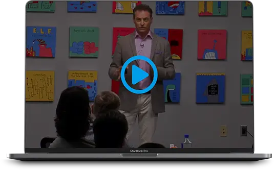
A designer’s worst nightmare – how to make sure your presentations can be read on any projector

I like pretty graphics.
I appreciate great design…
…and elegance.
Complex transitions, builds and animation.
Pastels, hues and transition.
They all help tell a story, bring emotion and life to every experience of presentation.
But they have no purpose if you're going to present in front of a live audience on stage.
Here's why:
If you're a speaker or presenter, at some point, you're going to have to present on someone's stage with a terrible 5-year old projector, poor lighting, bad focus and small screen.
And in the last row of the room will be a 70-year old man with “Coke-Bottle” glasses squinting, unable to read, frustrated and cursing your name loudly…
Because you didn't design your presentation for this situation.
On average, I present to live audiences 30-60 times per year.
Sometimes to 150 people, sometimes as many as 2,000.
My stuff can be read and seen by 55 year old eyes sitting in the worst seat in the house.
Because after years of trial and error, I've figured out the specifications that WORK.
Designers hate me.
(well, maybe HATE is a strong word…)
But my design-minded friends who walk in and present with skinny fonts, fancy backgrounds and crazy colors frustrate and annoy the audience starting at the 5th row because they don't know these little secrets.
And unfortunately virtually EVERY custom template that comes with Keynote, PowerPoint or even the beautiful fancy ones you buy violate almost all these basic rules.
Here are my presenter rules – in their design-infuriating glory…
Mike Koenigs “Design Specifications That Work On Virtually Any Projector, Any Stage or Any Monitor”
- Design for 55 year old eyes, sitting in the worst seat in the house, 100 rows back
- Crappy projector with an old bulb, unfocused
- NEVER use fancy non-standard or non-default fonts (PC or Windows) in case your computer breaks and you have to use someone else's machine
- Use black Arial font against white background (high contrast)
- BOLD Royal blue for highlights and hyperlinks
- Red is OK too for highlights
- Never use pastels or light colors
- Never use yellow – lots of people are color blind
- For transitions…
- .25 second “Pop” or “Reveal” builds for bullets
- .5 second cube transition between slides
- Never create “custom” fields for text
- Use a single field for headline (ideally white text over black)
- Use one field for all bullets, not multiple fields
- Use default fields – don't create custom templates because if you change your master slide, your “custom” slides will all have to be changed manually
- Never use “automatic” build (click to build only) in case your remote fails
- Never use exit builds – they take too long, mess up your timing and will puke if your remote fails
- Never use textured or gradient backgrounds (they break apart and are hard to read)
- Put all of your logos on a slide in your presentation so they can be copy/pasted
- Put a bunch of your standard clip art from previous presentations so they can be copy/pasted
- Delete all “extra” slides that aren't use in masters so the template master is clean and isn't huge
- Put page number and copyright fields on your master slides
When you create your slides, plug a crappy old projector into your computer, shine it on a textured wall in your house, open your drapes or windows during a sunny day and look at the slides in that environment.
This is a real-world test. If you can't read your slides, it's because you didn't design with CONTRAST in mind.
If you can still read and see what's on the screen, they'll work 🙂
Yea, I know I'm a designer's worst nightmare – but folks will forgive us for simple design but won't if they can't read what's on the screen!
What do you think?
Stay tuned – and I'll post a video with some slides in the future that are EASY to read and watch on ANY screen!

Capability Amplifier
My Podcast with
DAN SULLIVAN
Founder of Strategic Coach®
CANCERPRENEUR

MONEY PHONE
Money Phone: How to Turn Your Smartphone into a Six Figure Money-Making Marketing Machine and Enroll Big Ticket Clients Quickly and Easily with Mobile Text and Video Marketing


